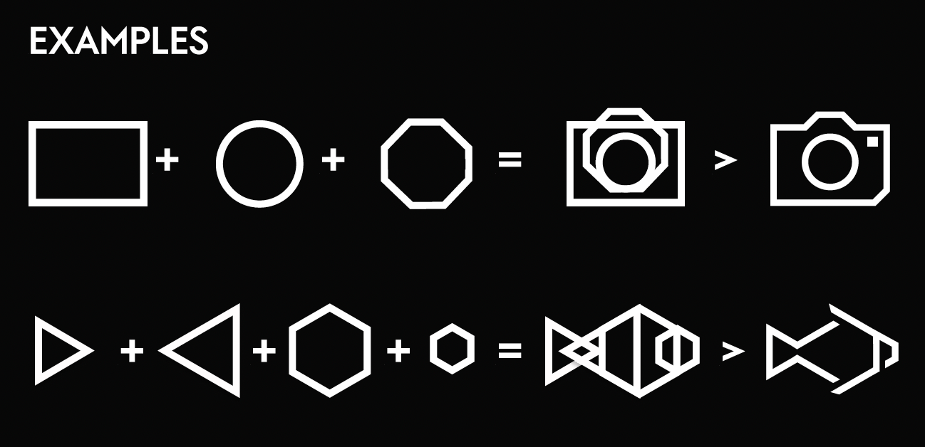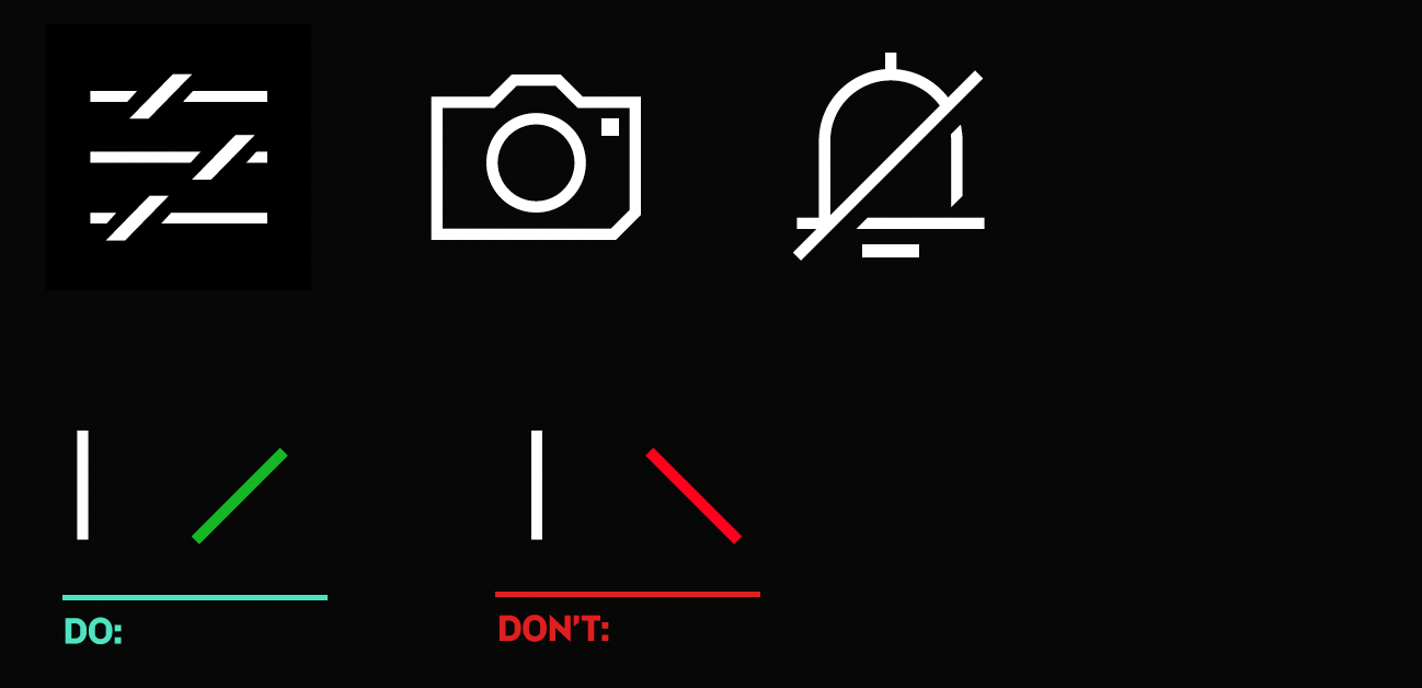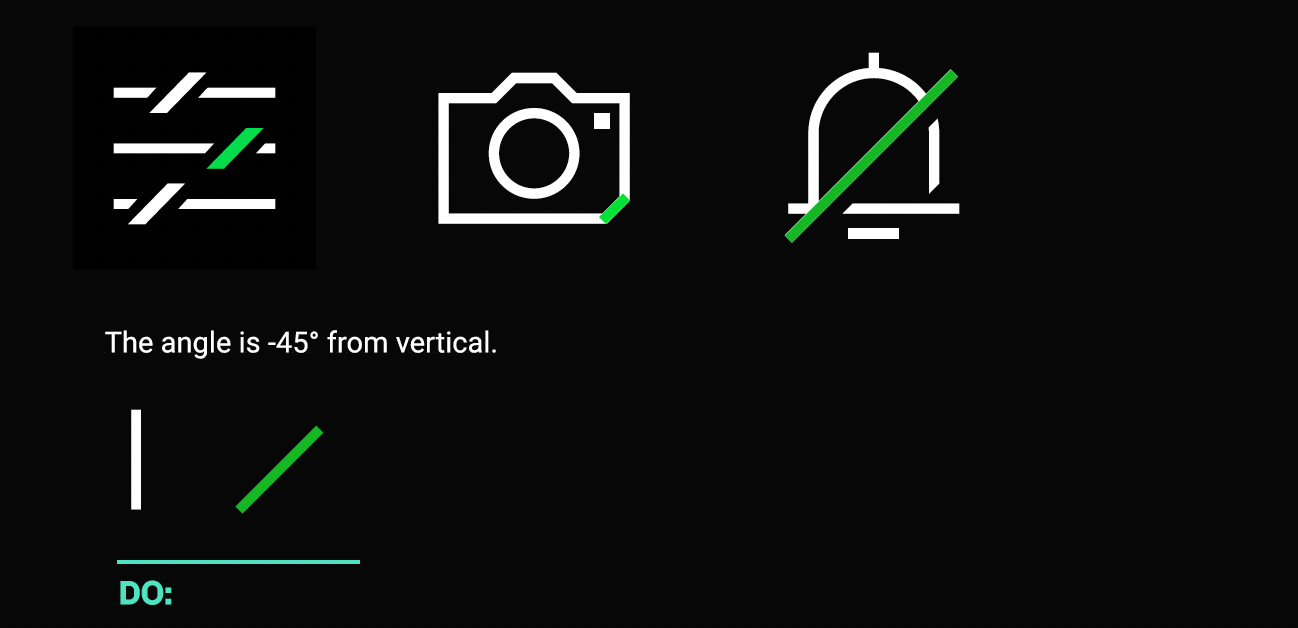


To align more with the Lynk & Co brand guidelines, I redrew and redesigned all the existing icons for both digital and physical applications. I drew up a simple set of construction guidelines, including a grid and graphical rules so that any future icons that were created would be graphically correct and the style would align with the existing icons. there were over 700 icons that were redrawn, then sized to 5 different application sizes, so teams didn't have to rescale any icons by hand.
